The Digital Literacy Myth
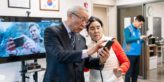
South Korea is currently obsessed with a Band-Aid. The narrative is everywhere: state-funded "digital centers" are heroically teaching the elderly how to navigate kiosks and smartphones. Journalists love it. It feels humane. It makes for a great photo op—a smiling grandmother finally mastering a QR code.
It is also a total admission of design failure.
The "digital divide" is not a deficiency in the elderly population. It is a deficiency in the engineering and product management circles of Seoul and Silicon Valley. We have spent a decade pathologizing aging when we should have been pathologizing lazy UX. When a 75-year-old struggles to order a bowl of noodles from a touchscreen, the problem isn't her cognitive decline. The problem is a UI that requires the spatial awareness of a fighter pilot and the dexterity of a surgeon.
We are wasting millions on "education" that essentially asks seniors to learn how to speak the broken, illogical language of machines. It’s the equivalent of giving someone a car with a steering wheel in the trunk and then opening a government school to teach them how to drive it.
The Tyranny of the Kiosk
I have spent years watching product teams optimize for "efficiency," which is usually code for "cutting labor costs by making the customer do the work."
In Seoul, the rise of the unmanned kiosk is framed as an inevitability of the labor market. The reaction from the public sector has been to create "digital helpers." This is a circular logic that serves no one but the hardware manufacturers. By training seniors to adapt to hostile interfaces, we are removing the incentive for companies to build accessible tech.
We’ve seen this play out in enterprise software for years. Companies spend millions on "digital transformation" only to spend millions more on "training." If you have to train a human to perform a basic, intuitive task—like buying a train ticket—your product is broken.
Most senior-focused "education" ignores the physical realities of the demographic:
- Reduced Contrast Sensitivity: UI designers love "clean" aesthetics, which usually means light gray text on a white background. To an aging eye, that’s invisible.
- Motor Control: Capacitive touchscreens are notoriously unforgiving. A slight tremor or a long press (often accidental) triggers a "long-press" menu that confuses the user.
- Mental Models: The "hamburger menu" (three horizontal lines) is a meaningless icon. It doesn't look like a menu. It doesn't look like anything. Yet we expect a generation that grew up with physical buttons to instinctively know it’s a portal.
The Cognitive Tax
The competitor articles on this topic suggest that technology "liberates" the elderly. That’s a comforting lie. For many, it adds a massive "cognitive tax" to their daily lives.
Imagine a scenario where every time you want to enter your home, the lock on your door changes its configuration. Sometimes you turn it left; sometimes you have to double-tap it; sometimes you have to scan your face and wait for a loading bar. You would be exhausted. That is the daily reality of a senior using a modern OS that updates its UI every six months.
We are asking people in the final chapters of their lives to spend their remaining cognitive energy on mastering the ephemeral quirks of a software update. This isn't empowerment. It’s digital hazing.
Accessibility Is Not a Charity Case
The industry treats "Senior Tech" as a niche category or a philanthropic endeavor. This is a massive business mistake.
The "Silver Economy" holds the most significant purchasing power in developed nations, yet we treat them like tech-illiterate toddlers. Designing for the elderly—often called Inclusive Design—actually makes products better for everyone.
A kiosk with high contrast, large targets, and a simplified flow isn't just "good for seniors." It’s good for the tired parent holding a crying child. It’s good for the person with a temporary injury. It’s good for everyone who wants to spend less than five minutes ordering a coffee.
Instead of building centers to teach seniors how to use bad kiosks, the South Korean government should be legislating UI standards. If a public-facing terminal is not accessible to 30% of the population, it shouldn't be allowed on the floor.
The High Cost of the Digital Helper
There is a dark side to these public centers that no one talks about: the creation of a permanent underclass of "digital dependents."
When we "help" a senior by showing them which buttons to click, we are often just teaching rote memorization. "Click the red box, then the blue box." This doesn't build digital literacy; it builds a fragile, temporary ability to perform one task. The moment the app updates or the UI changes, that knowledge is obsolete.
I’ve worked with developers who shrug off these concerns because "the next generation will be tech-native." That is a dangerous fallacy. Technology doesn't stop evolving. In thirty years, the "tech-native" millennials will be staring at holographic interfaces or neural links wondering why they can’t just use a simple smartphone. We are all "tech-illiterate" for the technology of the future.
Demand Better Tools, Not More Classes
The current approach is a victory for the status quo. It allows tech companies to continue shipping mediocre, inaccessible products while the government picks up the tab for "training" the victims of that design.
We need to stop asking "How do we teach seniors to use this?" and start asking "Why is this so hard to use?"
The solution isn't more classrooms. It’s more friction for the designers.
- Mandatory Accessibility Audits: Any technology used in public services should undergo rigorous testing by people over the age of 70. Not as a courtesy, but as a legal requirement.
- Haptic and Audio Feedback: We have moved toward a purely visual digital world. This is a step backward. Physical buttons provided tactile confirmation. Tech needs to rediscover the "click."
- The "Undo" Safety Net: The biggest barrier for seniors is the fear of breaking something. Most modern UIs make it incredibly difficult to "go back" without losing all progress.
If we want to bridge the digital divide, we need to stop trying to upgrade the humans and start fixing the code.
Stop the patronizing workshops. Fire the designers who think a 12-pixel font is acceptable. Build something that doesn't require a government-funded tutor to explain it.
Until then, these centers aren't symbols of progress; they are monuments to our failure.
The grandmother in that photo shouldn't be smiling because she finally learned how to use the kiosk. She should be angry that it was so difficult in the first place.